3. DMPs and DMRs
[1]:
from pylluminator.samples import Samples
from pylluminator.visualizations import dmr_manhattan_plot, dmp_heatmap, visualize_gene, show_chromosome_legend
from pylluminator.dm import DM
from pylluminator.utils import save_object

from pylluminator.utils import set_logger

set_logger('WARNING')  # set the verbosity level, can be DEBUG, INFO, WARNING, ERROR
3.1. Load pylluminator Samples
We assume that you have already processed the .idat files according to your preferences and saved them. If not, please refer to notebook 1 - Read data and get beta values before going any further.
[2]:
my_samples = Samples.load('preprocessed_samples')
Here, we want to filter out the probes on the X or Y chromosomes.
[3]:
my_samples.mask_xy_probes()
To speed up the demo, we will only calculate DMPs and DMRs on 10% of the probes
[4]:
ten_pct_probes = int(0.1 * my_samples.nb_probes)
probe_ids = my_samples.probe_ids[:ten_pct_probes]
print(f'Selected {ten_pct_probes:,} first probes')
Selected 93,768 first probes
3.2. Differentially Methylated Probes
The second parameter needed to create a DM object (here ~ sample_type) is a R-like formula that describes the model, and is used to create the design matrix. You can use one or more predictors in the formula, e.g. ~age + sex. The predictors names must be the column names of the sample sheet.
More info on design matrices and formulas:
[5]:
my_samples.sample_sheet
[5]:
| sample_id | sample_name | sample_type | |
|---|---|---|---|
| 0 | GSM7698462 | LNCAP_500_3 | LNCAP |
| 1 | GSM7698443 | PREC_500_2 | PREC |
| 2 | GSM7698435 | PREC_500_1 | PREC |
| 3 | GSM7698446 | LNCAP_500_2 | LNCAP |
| 4 | GSM7698459 | PREC_500_3 | PREC |
| 5 | GSM7698438 | LNCAP_500_1 | LNCAP |
[6]:
my_dms = DM(my_samples, '~ sample_type', probe_ids=probe_ids)
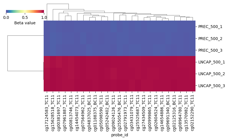
You can now plot the results, for the 25 most variable probes:
[7]:
dmp_heatmap(my_dms, my_dms.contrasts[0], nb_probes=25, figsize=(8, 5))
3.3. Differentially Methylated Regions
We can then identify ths DMRs by grouping neighboring probes with similar methylation patterns for a given predictor contrast. Similarity is calculated based on the Euclidean distance between probes’ beta values.
[8]:
my_dms.compute_dmr(my_dms.contrasts)
save_object(my_dms, 'dms')
[9]:
# get top DMRs and their associated genes for the first contrast, PREC
my_dms.get_top_dmr(my_dms.contrasts[0])
[9]:
| segment_id | chromosome | sample_type[T.PREC]_avg_beta_delta | sample_type[T.PREC]_p_value_adjusted | genes | |
|---|---|---|---|---|---|
| 6 | 23362 | 10 | 0.958207 | 1.090462e-09 | ADD3;ADD3-AS1 |
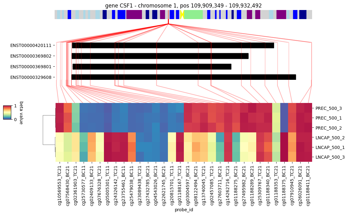
| 2 | 2717 | 1 | 0.953852 | 4.468449e-11 | CSF1 |
| 4 | 12902 | 5 | 0.953391 | 3.811058e-09 | FGF18 |
| 5 | 15935 | 7 | 0.952179 | 1.141308e-09 | PDGFA |
| 7 | 26201 | 11 | 0.951443 | 2.134230e-07 | NOX4 |
| 1 | 2632 | 1 | 0.949990 | 1.898161e-06 | GPR88 |
| 9 | 41467 | 19 | 0.948995 | 1.961167e-08 | ENSG00000289915 |
| 8 | 39964 | 19 | 0.947737 | 6.353884e-09 | TGFBR3L |
| 3 | 11071 | 4 | 0.947690 | 2.126866e-09 | FAM149A |
| 0 | 2064 | 1 | 0.947685 | 3.123050e-10 |
[10]:
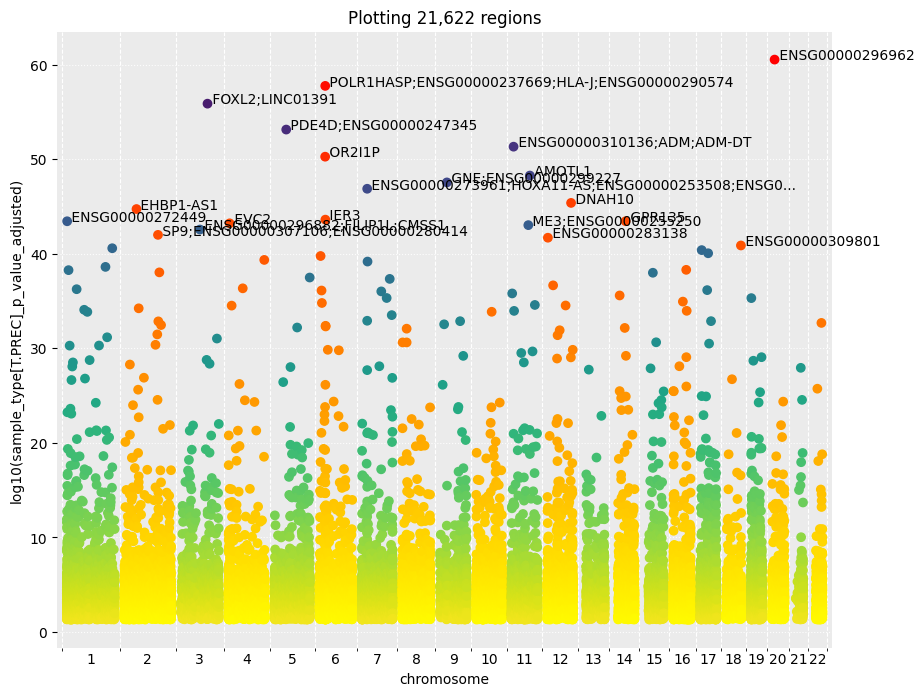
# visualize the DMRs for the first contrast
dmr_manhattan_plot(my_dms, 'sample_type[T.PREC]', nb_annotated_probes=20) # by default, plots the DMRs depending on log(p-values)
# dmr_manhattan_plot(my_dms, 'sample_type[T.PREC]', y_col='sample_type[T.PREC]_avg_beta_delta', log10=False, nb_annotated_probes=20) # example to plot DMR depending on the beta values difference between the two groups
3.4. Gene visualization
We can then have a look at a particular gene identified as differentially methylated, for example CSF1. The heatmap of the beta values of the probes associated to this gene shows a clear methylation difference between the healthy cells (PrEC) and the prostate cancer cells (LNCAP).
[11]:
show_chromosome_legend()  # display the legend for chromosome regions colors, corresponding to Giemsa staining
visualize_gene(my_samples, 'CSF1', figsize=(10, 5))